Initial situation
Previously, reports from our customer were accessed and viewed in different systems, resulting in time-consuming report queries. The key figures were not calculated according to uniform definitions, which led to different levels of information for the company's report consumers.
The goal was to create a fast reporting at a central point (single point of truth). Furthermore, it was important to enable increased transparency in all reported areas. The variability of Power BI also ensures high availability on all devices (desktop, tablet & mobile).
Implementation
Hotline statistics can be used to analyze the performance of call centers and ticket systems. For this purpose, among other things, the data of the telephone system is read out to determine key figures such as the accessibility of the hotline or the average call duration. By linking the ticket system, a detailed overview of various key figures such as the service level, the resolution rate or generally the total volume of tickets can be created. All key figures were defined and worked out with the respective persons in charge in order to ultimately provide a binding basis for decision-making.
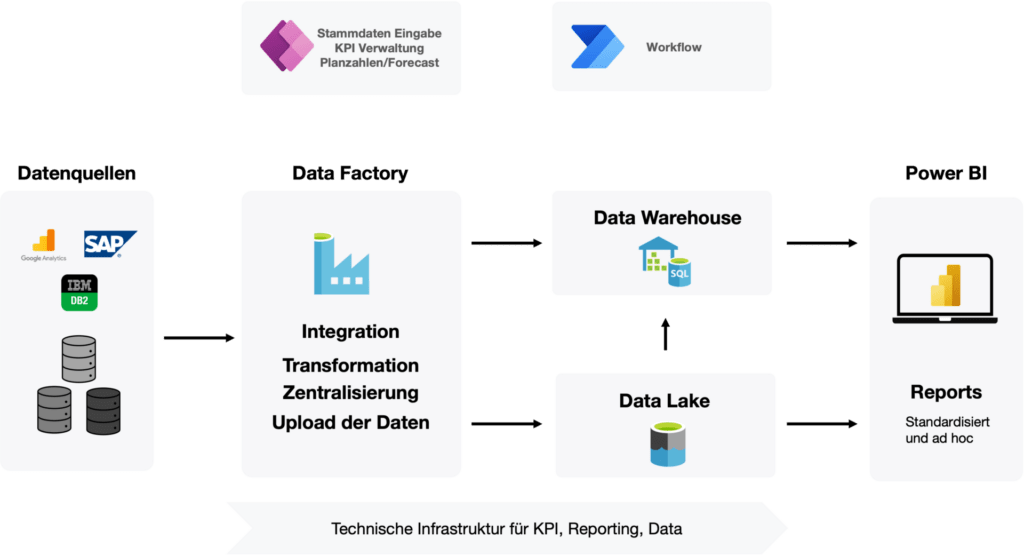
In addition to the integration of CSV and Excel files via a file share, data from Google Analytics, Azure databases and a ticket system based on an on premises SQL server were integrated. A comment function was created via a Power App, which enables the area managers to evaluate the current development. Data for billing-relevant KPIs is stored in a data warehouse and the KPIs are calculated there to ensure traceability of the data and to create a single point of truth for all interested parties that can be tracked for years.
Dashboard
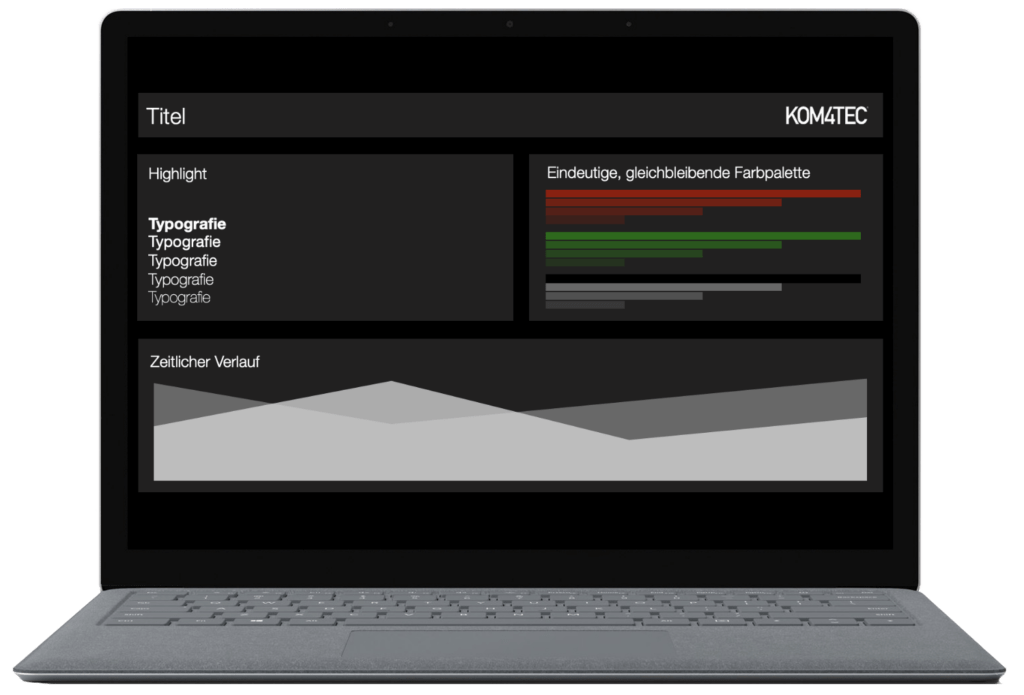
A categorized overview of various sub-areas is provided via the dashboard. The dashboard is intended to provide an initial overview of the most important KPIs. The current status, the evaluation of the status using a predefined traffic light system, and the trend over a defined period are displayed. The initial page thus conveys at first glance the areas in which action is required; jumping off points then take the user to the corresponding detailed pages, on the basis of which measures can then be taken.

Key figures configuration
Two additional power apps are linked to the dashboard. A parameter app and an app that rates comments and visualizes them via the dashboard.
Parameters app
On the one hand, the parameters of the traffic light system can be variably set via a power app, i.e. the threshold values at which the traffic light switches, as well as the respective target values and weightings of the individual key figures. These apps also write back to the Azure SQL data warehouse.

Comment function
The second app was added in order to be able to evaluate and justify the individual overall key figures. The comments are recorded via the Power App by the respective key figure managers and visualized in the dashboard.

First-time fix rate
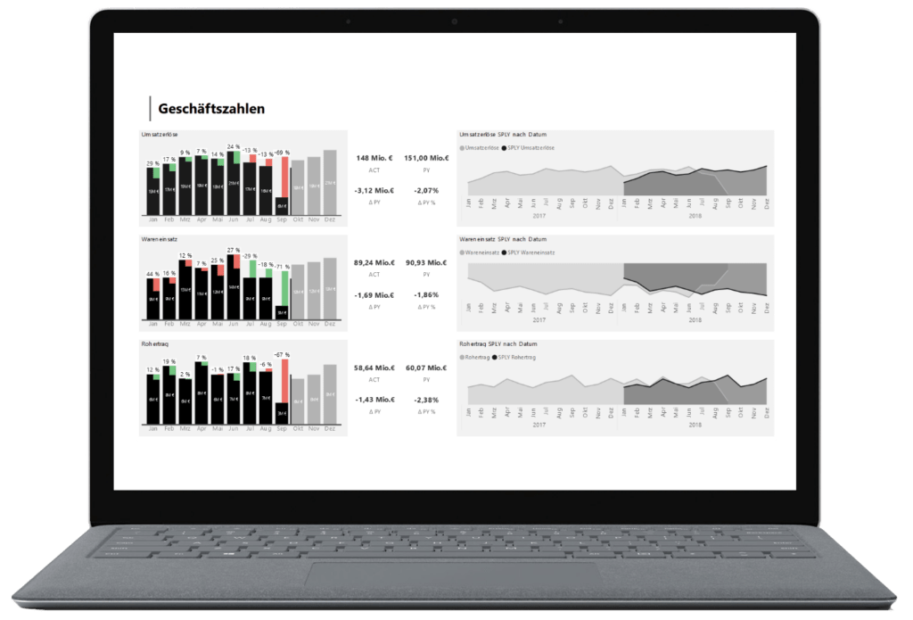
The first-resolution rate expresses how many customer inquiries/procedures were answered at the first contact. This means no forwarding and no repeated response were necessary. With its various filter options, the report page provides information on how the first resolution rate develops according to transaction type, input channel or keywords in the ticket. Among other things, a speedometer is used as visualization, which reflects the limit values that were previously defined via the parameter app. Furthermore, the development over time is displayed via a classic bar chart, which enables a display on year, month or day level via the drill function. The development between the previous month and the completed month as well as the resulting delta is visualized via KPI tiles, which immediately provide an indication of the development of the key figure.

Conclusion
With the help of Power BI, we were able to provide our customer with centralized reporting. Numerous key figures and data are now evaluated centrally, thus creating a great time saving for the report consumers. Furthermore, the following advantages could be achieved:
Time savings: Thanks to centralized reporting, individual data no longer has to be painstakingly searched for together.
Cost savings: Power BI's high level of compatibility eliminates the need for third-party reporting and data management tools.
Standardization of reporting: Uniform reporting standards in terms of content and visual appearance ensure greater transparency of data and lead to greater acceptance among report consumers.
Availability: The report is available to all authorized employees at any time.